Showing posts with label papercrafts. Show all posts

Friday, October 19, 2018

Boo to you! Halloween is coming.....

As we slide further from sweet summertime, there is a definite chill in the air here in the Midwest. I can't help but think about how much this time of year always triggers memories of my children's Halloween fun, as well as that of my own childhood.  

Anticipation of that magical day (and sometimes entire weekend) is still contagious.  In fact, like many parents in our friendly neighborhood, I usually also get into the spirit of fun by wearing wigs or funny hats, along with orange and black clothing to greet all the trick-n-treaters that appear at my door.  On those Halloween days when the weather is drop dead gorgeous, I'll also spend hours outside greeting everyone...and just enjoying all that fun going on around me!  

But now is the time to get ready.  It's time to get that pumpkin, decorate the house....and create some cards for neighbors and friends.


For this project, I have used two of my new stamp images from Impression Obsession to create a card that will appeal to all ages--including all those "special" little pumpkins! 

Here is what you will need:

D7891 Little Witch
C7979 Scary Pumpkin 1
C7980 Scary Pumpkin 2

Clearsnap:
Colorbox®️ Premium Dye ink pads: Banana, Tangerine, Licorice
Colorbox®️Mix’d Media Inx ink pad: Jasmine
Art Dauber

Beacon Adhesives
Zip Dry®️ Paper Glue

Sizzix/Ellison:
Swirls Embossing folder

Here's what to do:

1. Apply both Banana and Tangerine ink to each of the pumpkins. Stamp along the bottom edge of a white cardstock scrap; dry.  
2. Stamp the witch in Licorice, overlapping slightly over the pumpkin(s). Cut angled corners.  3. Dab Licorice around all the edges of both the stamped layer and a purple notecard; dry.
4. Pressure emboss a black cardstock scrap. Lightly dab Jasmine pigment ink over the raised sections; dry. 
5. Attach all the layers to the card using Zip Dry®️ Paper Glue.

I just LOVE it when I can use up scraps from my stash!


Sunday, October 14, 2018

Basic Stamping Techniques for Beginning Stampers


Cats on the Edge is a very simple card, drawing on very basic stamping techniques.  This is the kind of card that is PERFECT for a beginner stamper to do!  And, since there is no coloring involved, it is also a super quick card to make. The same Art Dauber technique used in my previous blog post is also used here to create a cheerful background.  


Both the E7983 Black Cats and E7840 Web Border are from my stamp line with Impression Obsession Rubber Stamps.  Clearsnap's Colorbox®️ Premium Dye ink pads (Tangerine, Grape, Licorice) are used, along with Beacon Adhesives Zip Dry®️ Paper Glue.

Simply stamp the Web Border on a white cardstock scrap in Grape; stamp the Black Cats over the border using Licorice. Punch rounded corners. Dab Tangerine around edges with an Art Dauber.  Cut an orange cardstock layer and dab Licorice around the edges.  Use Art Daubers to create the random colorful dots on the notecard.  Attach all the layers with Beacon Adhesives Zip Dry®️ Paper Glue.

Additional embellishments can be added as desired.  I just added a strip of coordinating ribbon but you could also add a small spider, stars or a phrase.  Just use your imagination!

Comments always welcome!

Tuesday, October 9, 2018

Oh no! Is Autumn Already in the Air?!

Summer is barely out the door but autumn is already in the air!  I already see trees turning color here in Chicagoland....and we are all feeling the chill in the air enough to turn our furnaces on now at night and add that extra blanket.

So....what's a girl to do but give in to the season ahead and start stamping some HALLOWEEN cards!  Somehow, that seems to make the chill of the season a lot less spooky.....

I thought I would start with one of my latest stamps from Impression Obsession Rubber Stamps....

D7982 MUMMY!

(I never could draw scary....so it's a CUTE mummy!)


I used TWO fun techniques in this card.  

First I stamped the Mummy on a white cardstock scrap with Licorice Colorbox®️ Premium Dye ink pad.  Then, instead of lifting the stamp up, I rotated it so I got additional impressions that gave it a look of movement.  How fun is this look!

Next, I grabbed some Art Daubers and had some play time on the notecard!  I created a random pattern using Colorbox®️ Premium Dye ink pads (Banana, Tangerine, Grape).  Then attach the layers with Beacon Adhesives

Zip Dry®️ Paper Glue.

Please let  me know how you like these techniques and project by leaving me a comment….


Tuesday, May 29, 2018

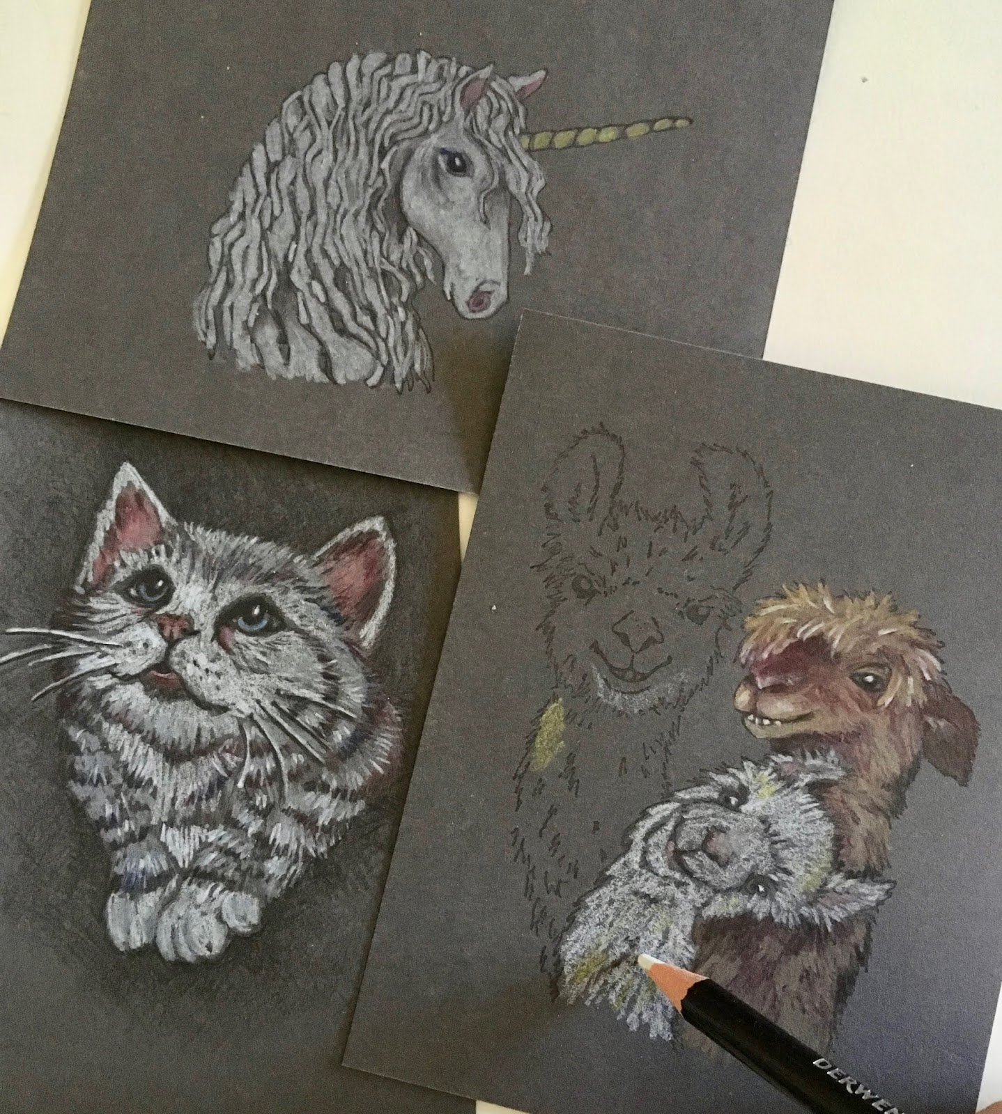
Add Drama to Stamping with Colored Pencil Techniques

Have you ever colored your stamped images with colored pencil and been disappointed with the results?  

Well...that is all about to change!  Just keep reading....


I have recently been experimenting and perfecting THE COOLEST color pencil technique ever!

All my stamp images are from Impression Obsession and can be found here.


It all started as a simple serendipitous "surprise". I had stamped an image on a dark grey cardstock scrap. Yep, that was it.  I then had one of those "oh no, what do I do now" moments when I realized DUH,  how do I now add color?

Most typical coloring mediums used with paper crafts (like ink, marker and watercolor) are transparent. They don't work at all on dark surfaces.  And, while most opaque mediums like acrylic paint, pigment ink and pastel will show up on the dark cardstock, they also obliterate outline and detail lines on my stamped image.

So....I'm thinking what to do...what to do.....and then POW! Light bulb moment. How about colored pencils?! 

I quickly pulled out ALL my colored pencil tins and started experimenting with the different brands and types I had available. (Why I actually have so many different brands and types is a WHOLE other story in itself.)

 And, WOWZA!  This translucent medium really pulled it off.  Actually, more than just in an average kind of way. Truth is....they were AMAZING!


All my stamp images are from Impression Obsession and can be found here.

Colored pencils are the best of all worlds.  They work by adding translucent layer upon translucent layer until you get the color and intensity you want.  Each layer is affected by the layer beneath...and that includes the color of the substrate used beneath that very first layer. 

Then came the experimenting as I quickly discovered not all color pencils perform the same on all substrates.  Different brands AND types can work very differently.  Some are harder, some softer. Some pencils wind up with a waxy buildup (called "bloom").  The pencils in some brands and product lines seem to lay down more intense color while others need more layers to be built up for that intensity.

And then there is the variable of the actual colored cardstock.  Uncoated cardstock worked the best.  I found smooth cardstock has better results than textured cardstock simply because the stamped image is crisper plus the colored pencil often won't attach well to the indentations and grooves in the texture. Cardstock color and value (dark, mid-ground, light) will also affect the color pencil results. So, it is best to test your color palette on a small cardstock scrap before beginning an actual project.

Here comes the REALLY cool part:  You do NOT need to be an "artist" to try this technique.  And I mean you will SUCCEED when you try it!  All you need is to know basic color theory, ie, blue + yellow = green.  Primary colors are the basis for everything (red, yellow, blue)  secondary colors are made by mixing two primary colors (orange, green and purple) and complementary colors are opposite each other on the color wheel. That's it, kids. And, surprise....using a rubber stamp image even eliminates the need to be a skilled sketch artist.


All my stamp images are from Impression Obsession and can be found here.

However, I do understand that many people may still be a little intimidated by colored pencil. Since my experimenting I have developed steps to this technique that will give you confidence and insure your success. 

This first tutorial is only covers stamping and coloring on a very NEUTRAL cardstock...dark grey.  By using a dark grey "ground", we have already laid in some of the tonal shadows.  This is the perfect cardstock to choose when using images that are lighter in tonal value.

All my stamp images are from Impression Obsession and can be found here.


Here are a few tips:
1. Begin coloring using the LIGHTEST color....normally WHITE, followed by light grey, light tan, light yellow, blue, green, pink or whatever colors your piece will be.  Add your lightest and most striking highlights first.  Where desired, the highlights can cover up the stamped outline or detail.
2. Start laying in your DARKEST shadows next.  But...not everywhere.  Just where they will be the darkest.  You will add more shadow layers later.
3.  Start building layers of your mid-tone colors, adding color on top of color until you get the intensity and shade you want.  Add your lighter and deep colors again in some of the layers so they become embedded or sandwiched in between color layers.
4. End by adding a few more strokes of white highlights...and the darkest of dark shadows.
5. If you want to get "artsy" really quick, create your deep shadow tones by adding the complementary color instead of just adding black. Then add layers of the other two primary colors to blend So, basically, you add shadows using the colors MOST unlike the color of the item you are adding the shadow to.  if you add shadows to a green leaf (green is made of blue + yellow), you will also use a deep red layer to create a richer shadow. Blend with a little purple and add a little orange if desired.  Conversely, if you are adding shadows to a purple item, you should add yellow but also add the dark green and dark red to blend.  You will get the hang of it once you start experimenting.
6. Best tip is to do "practice pieces" on cardstock scraps.  I have found that the simple act of making something that "doesn't count" before doing  the final piece where there can be no mistakes, often frees up our ability to take risks and just "flow".

All my stamp images are from Impression Obsession and can be found here.

Next time on the blog, I will go into more detail covering colored pencil on amid-range colored cardstock.

All stamp images copyright by Gail Green LDL/Impression Obsession.  All content on this blog post and all posts on this blog copyright Gail Green.  Do NOT copy or use any of this content without written permission from the author and artist Gail Green.  

Friday, August 18, 2017

Summer Bliss Topped with a Hint of Fall

Hope everyone has been enjoying the summer!  Have you been traveling or enjoying local festivals, and farmers' markets? Or have you been chilling in the hammock and sipping ice tea?

While much of the country may still be in toasty hot mode, Chicagoland and neighboring parts of the Midwest have been enjoying a more moderate summer. In between the record breaking rain (and subsequent flooding), our temps have been comfortable enough to keep windows open part of the day and throughout the night.  That definitely saves on our air conditioning bills!

However, temps like these also remind me of what is just around the corner. Since it feels a little bit like autumn, it seemed logical to stamp some fall-like cards--especially after I received my "happy mail" with samples of my brand new fall stamp images from Impression Obsession!

Happy stamping!


Thursday, August 10, 2017

Color Pencil Guide

Looking for help with coloring stamped images with color pencil?  Good news!  My new guide and tutorial "How to Color: Colored Pencil Basics for the Crafter" is now live on the Favecrafts website!

This article is totally STUFFED with great information, including basic color theory, pencil strokes, color layering steps and more. Best of all, I've also included a step-by-step tutorial to help you in your journey.

Please check it out...and leave a comment!

How to Color: Colored Pencil Basics for the Crafter


Saturday, February 18, 2017

CHA Creativation Show Spotlight on Joanne Fink

I don't know where time has flown but I do know it has been a busy few weeks of follow up plus deadlines...and I'm still not finished.  When deadlines take over, I focus solely on what I need to do to meet those deadlines--whether drawing/painting new art collections, prepping artwork into product presentations or creating projects for publication and writing instructions. Throw in some time with family, animals and the grandbaby.....and poof!  It's already been longer than promised but here is my next post about my experiences at the CHA Creativation Show.

As mentioned before, one of the highlights each year is reconnecting with friends in the industry. One of my favorite things to do at the show is to help celebrate their successes.

I LOVE my friend Joanne Fink!  In the years we have known each other, we have both gone through many professional collaborations, changes and successes--as well as personal challenges.

Joanne's lovely smile radiates her beautiful inner spirit....


 Joanne is the art and heart behind the Zenspirations brand and her fan base is worldwide.  Not only am I so happy for Joanne's success, it was a joy to take photos at the Fox Chapel Publishing booth as she began her book signing event for her new co-authored book on bible journaling "Complete Guide to Bible Journaling".  The book is FILLED with her signature art, tons of great samples and pages of elements the reader can use to create personalized pages.

And I am thrilled to have my very own signed book!